
Blog
Insights across the world of tech including software engineering, digital product strategy and development, data and AI, and emerging technologies.

AI/ML
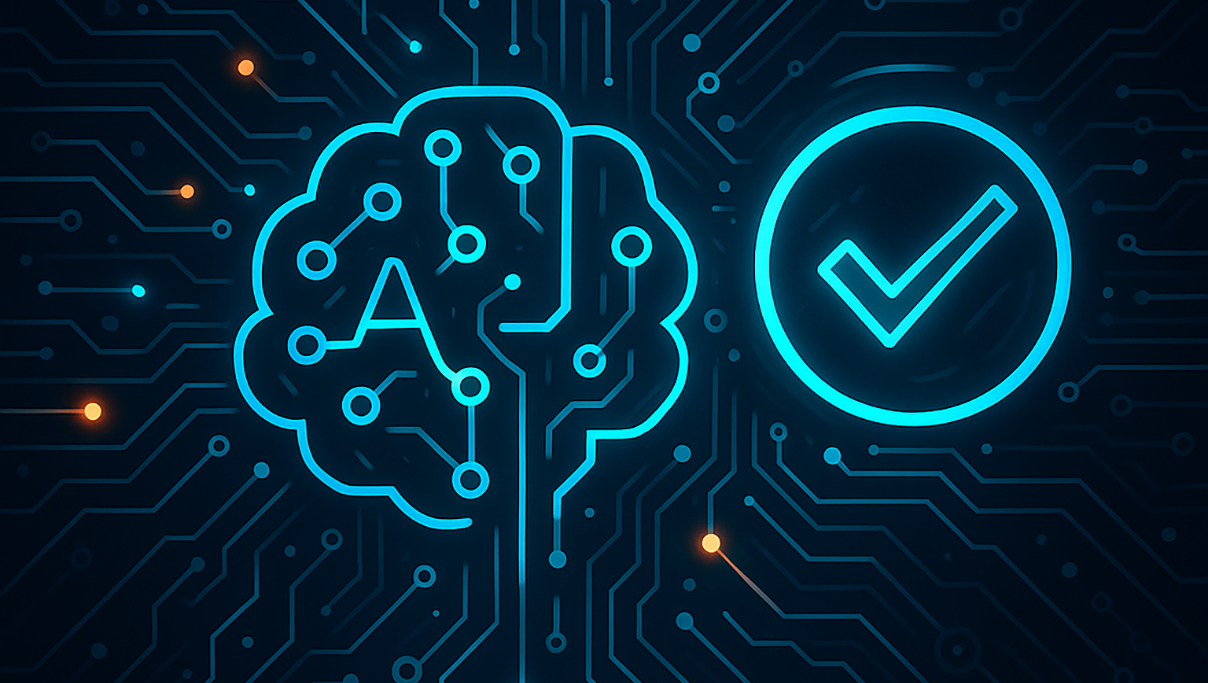
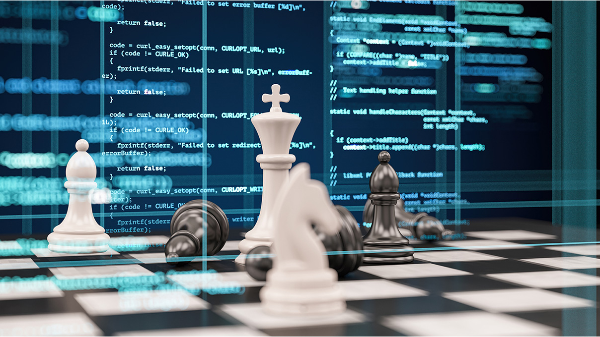
The Importance of Guardrails for Secure and Responsible AI Applications
January 13, 2025Guardrails are an essential layer of defense, ensuring AI systems remain safe, reliable, and aligned with ethical guidelines. They not only enhance security but also optimize performance, enabling organizations to strike the right balance between innovation and risk mitigation.
Read more


Stay in Touch
Keep your competitive edge – subscribe to our newsletter for updates on emerging software engineering, data and AI, and cloud technology trends.