Data Visualization using D3.js
Have you ever thought about including some charts and graphics in your application? Then you must have explored some charting tools or libraries, like Google charts, Highcharts, or D3.js.
In this blog post, I’ll look specifically at D3.js, which stands for Data-Driven Documents. D3 is a JavaScript library written by Mike Bostock for manipulating documents based on historic or real-time data using HTML, SVG, and CSS. D3 permits you to tie self-assertive information to a Document Object Model (DOM), and afterward apply information-driven changes to the archive. Using D3, data can be represented in numerous ways, like a stream outline chart, pie chart, line chart, disseminate plot, parallel chart, and so on.
D3 In-Depth
D3 takes care of the essence of the issue: productive control of reports based on information. D3.js accentuation on web gauges gives you the full capacity of present-day programs which binds you to a restrictive system consolidates effective representation parts, and provides you with an information-driven way to deal with DOM control. With negligible overhead, D3 is smart and quick, and able to support substantial datasets and element practices for communication and activity. D3’s practical style permits code reuse through an assorted accumulation of segments and plug-ins.
Properties
- Selections: A selection is an array of elements pulled from the current document (DOM). D3 utilizes a revelatory methodology, working on discretionary arrangements of nodes called selection.
d3.select("html").style("color", "blue"); //selecting the root node html to set the color of all the child elements to be blue d3.selectAll("p").style("color", "white"); // selecting all the p elements to set the color of all p elements to be white. - Transitions: A transition is a special kind of determination where the operators apply smoothly with transition as opposed to momentarily.
d3.select("p.brush").transition().duration(750);// selecting all p element to show in 750 milliseconds.
There are other utilities for SVG, Time, Geometry, Geography, Layouts, and Scales, which provide diversified user experience for charts, graphs, maps, and tables.
Here is where you can find more insight into these utilities.
Project
In one of the POCs for a client of ours, we worked on D3 to get Assets data plotted in a useful and informative way.
Background
Our client has a number of portals. The portal on which we worked provides a full suite of reliable and scalable managed services, including Application Services, industry-leading Enterprise Housing, and Managed Cloud. The portal also has a few assets, such as server and firewall, among others, which have minute data to monitor the device features and attributes (like C: drive/D: drive usage, latency rate, disk percent full, disk queue length, etc.). The client has asked us to represent this data set in an appealing manner, so that the client’s end user can facilitate the status of their devices.
Approach
These are a few of the major issues that we confronted:
- We must dig into the data and apply some permutation and combination to understand which set of attributes we can combine to give some significant information to the end user
- The real-time data must be broken down up to a certain granular level
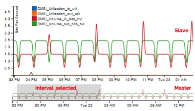
So, in order to overcome these issues, we developed the master-slave approach. With this approach, the master graph is acting as the full width graph (over the total time) while the slave graph is shown based on what interval is selected in the master graph.
Creating the Chart
- Create a container for the SVG element to add
<div id="lineChart"></div>
- Apply some orientation and properties to the SVG element and its container
a) var svg_main_width = 500, svg_main_height = 430, context_scale = 1 / 5, margin = {top: 20, right: 0, bottom: 30}, margin2 = {top: 20, bottom: 100, left: 50};
		//this sets the height, width, margin of the master and slave graph
b) var parseDate = d3.time.format("%m/%d/%Y %H:%M").parse; //in order to parse the time axisc) var x = d3.time.scale().range([0, width]), x2 = d3.time.scale().range([0, width2]); var y = d3.scale.linear().range([height, 0]), y2 = d3.scale.linear().range([height2, 0]); // to set the x and y axis range of the master and slave graph
d) var color = d3.scale.category10();
	// initialize the color object
- Based on the above properties, create the SVG element
var svg = d3.select("body #lineChart").append("svg") .attr("width", svg_main_width+30) .attr("height", svg_main_height); - Set the X- and Y-axis orientation
var xAxis = d3.svg.axis().scale(x).orient("bottom"); var yAxis = d3.svg.axis().scale(y).orient("left"); var yAxis2 = d3.svg.axis().scale(y2).orient("left"); var xAxis2 = d3.svg.axis().scale(x).orient("bottom"); - Call the real-time data. You can use tab-separated file (TSV), comma-separated file (CSV), or AJAX call to get the data.
var data = ‘’; d3.tsv("/data/chart/datafile.tsv", function(error, data) { console.log(data); }); //parse the data as per structure of tsv file - Draw the chart
d3.tsv("/data/chart/datafile.tsv", function(error, data) {
	console.log(data);
var chartData = focus.selectAll(".chartData").data(data).enter()
.append("g").attr("class", "chartData");

    chartData.append("path").attr("class", "line").attr("clip-path", "url(#clip)").attr("d", function(d) { return line(d.values); }).style("stroke", function(d) { return color(d.name); });
});
Now you can add a mouseover state, focus state, tooltip, and many other elements in the graphs.
Below is a video which demonstrates the implementation of D3.js with master-slave graphs and how it has been used against multiple assets and their attributes.
If you’re interested in finding out more about D3.js, you can visit the official D3.js website for more information, or feel free to leave comments below.