Change Blindness in UX
There is a strong discrepancy between the amount of information being transmitted and the amount of information our brains have the capacity to process.
I have always been fascinated by the way the human brain works and I also think that being familiar with cognitive science is a key skill of any designer. In the digital world, there is a huge number of websites, apps, articles, and advertisements trying to get our attention.
People are programmed to focus their attention on anything that is different or new.
As you are reading this article, there are numerous sensations, sights, and sounds going around you. The traffic sounds, other people talking around you, the warmth of the room or maybe the memory of a conversation you had earlier today.
So, depending on your ability to focus, the brain can induce a specific blindness that makes you miss the changes happening in your visual field.
In one experiment, participants were shown an image that was changed during a brief blank interval in the visual scene. The researchers found that when there is a brief break in the visual scene, people find it more difficult to detect changes. This is called change blindness.
Change blindness is a common phenomenon in the digital world, where visual elements can appear and disappear or change their label almost instantaneously. For example, observers often fail to notice major differences introduced into an image while it flickers off and on again, like a page that refreshes. In many cases, the changes in the visual seem so big, that they seem impossible to miss. Yet when attention is directed elsewhere, people are capable of missing both minor and major changes that take place right in front of them.
Change Blindness is rooted in the human brain’s instinctual ability to filter out unnecessary information and stimuli. Basically, any time a new visual element is introduced to an existing display, it is at risk of being ignored.
Here is a popular example about how change blindness works, on the Vans.com mobile website. If a visitor selects a size that is not available, the label of the “Add to Cart” button changes to say “Out of Stock.” This slight, but important, change in the label doesn’t stand out, when the rest of the display stays the same.
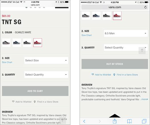
This is happening because:
- One: the user’s attention is focused here on the Size and Quantity fields
- Two: The “Out of Stock” label was overlooked because it looked too much like the “Add to Cart” label, and was too far from where the user’s attention was focused. Although the design is perceived by our senses (vision, touch, hearing), it is immediately processed by our brain. As designers, we have the power to guide the human mind during and even beyond the interaction with the product by using some key steps in our design process:
1. Make your page easy to scan
Remove clutter and make the page as easy as possible for your user to achieve their desired outcome, rather than trying to find actions or buttons. An important part of the design is making it highly usable for the targeted users and allowing for extra functionality to be discovered as it is needed. This will help you fight change blindness and will help you increase the conversion rate.
2. Minimize visual interruptions
Avoid page refreshes whenever possible. This will cause an interruption in the user’s visual perception and lead to an unnecessary shift in their attention.
3. Provide smooth, continuous feedback
Keep users informed about what is going on within reasonable time, without leaving them wondering and waiting. You can do this through: loading bars, spinners, active state of a button, scroll flag, feedback sounds, etc. Also, make sure the feedback is delivered in a natural place, where the user expects it, so it can be followed and understood.
4. Use appropriate visual emphasis for significant new elements (such as contrast, size, and padding) to ensure they are noticeable.
Use data from multiple sources to get a more accurate picture; combine the insights you gain from your experience and knowledge, your quantitative web analytics, and qualitative sources (like surveys, heat maps, sessions replays, or usability tests).
5. Rely more on recognition than recall
Minimize the user’s memory load by making actions, elements, and options visible. Therefore, the users won’t need to remember information from one part of the dialogue to another. Instructions for use of the system should be visible or easily regained.
6. Focus on aesthetic and minimalist design
The less elements on the screen, the more potent the remaining ones are. Focus on using only relevant information and avoid every extra details or element that could be irrelevant and that will cause an unnecessary shift in user’s attention.
7. Build products with consistency and standards
Make sure that the users won’t have to wonder whether different words, labels, colors, or actions mean the same thing.
8. Prevent errors
Try to either eliminate error-prone conditions or check for them and provide users with a confirmation option before they commit to the action. Even better than good error messages is a product that prevents a problem occurring in the first place. This will help you keep users focused.
9. Use good contrast
Use tools to measure the contrast you are using. Low color contrast creates legibility problems. The basics of color contrast are easy to understand: a higher contrast between text color and the background color is better for legibility.
10. Mind the Typography and build a visual hierarchy
Typography has a huge effect on the mood and attention of users and also, by using the right typography, we can improve user engagement.
This is more than selecting fonts. It is the study of how humans read, perceive, how they recognize words and how the brain processes the information.
So why should anybody care about Change Blindness?
Change blindness is a psychological phenomenon that affects user perception in this digital universe. As designers, we have the power to control the human mind during and even beyond the interaction with the product and bring more value to the digital world by using our knowledge on cognitive science to improve the digital world.
Change blindness plays an important role in the way users understand and look at digital products. It’s important to notice that people often fail to detect changes to a visual scene and why users don’t see what you think they actually should see. Being aware of this cognitive phenomenon and understanding how to avoid it can aid you in creating your design strategy and process.
Oana Mihail originally published ‘Change Blindness in UX’ on Medium here.
Recent blog posts


Stay in Touch
Keep your competitive edge – subscribe to our newsletter for updates on emerging software engineering, data and AI, and cloud technology trends.